I like this magazine advert as it has the strong, singular image at the top followed by the information at the bottom. This one has the style I am most likely to use, the top mimicking Jessie J's album cover and the bottom telling people the title of said album and the title of the number 1 song that features on it, I like the strong use of black and white contrast in this add with the hint of gold which stylizes the advert.
Sunday, 22 March 2015
Monday, 16 March 2015
Digipak Design
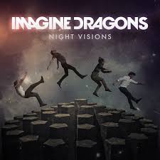
I really liked the black and white shots in our video so I decided to make my digipak black and white. I really wanted to stylize it taking inspiration from Imagine Dragons with the white background with harsh contrasting off-centered black shadow. I included the poker chips and card suit symbols to tie in the theme of gambling and playing a game which links the digipak with the video.
I also took inspiration from the script with their album cover but instead of heads within a head I edited strips of faces together, each face taken from one of the four people around the table in our video. This keeps the cover quite abstract and has the edgy feel like Imagine Dragons which I was going for.
I chose to put the band name across the eyes as removes the identity from the identity of our artist, and the video for our song 'Within An Ace of Reality' is focused about identity.
Sunday, 8 March 2015
Magazine Ad Research - Rihanna
This magazine advert is very stylized with the blue hue and stands out however I don't feel it is as impact-full or modern as it could be. I do like this common simple setup of the closeup shot on the top half and the info on the bottom. I like how the white background of the writing looks like it's been ripped into the image and how the writing is stylized and off-kilter.
Friday, 6 March 2015
Digipak Design Research
Whilst thinking of designs for my digipak I thought it would be best to look at three different arists who could be considered part of my chosen genre and look in depth at how they've constucted they're covers and digipaks. The artists I chose were Rihanna, The Script and Imagine Dragons.
Rihanna:
Rihanna's digipak is all about star image. There is a focus on her red hair which flows well with the red colour of the roses which leads onto the rose design of the disks. There is no link between the album title 'Loud' and the design of the digipak. However, it does get across Rihanna's personality and music style to to her target audience and a design like this allows them to instantly recognise that this is her album.However, I am not too fond of the writing in this album as it is very thin and faint making it hard to read.
The Script:
I like how this album cover is very simple and in black and white. The band's name is in a stylized font so it stands out and it is easily recognisable (like a logo, something to think about in my design), the title of the album is also bold and clear in the corner. Like Rihanna, there is still a star focal point in this cover as the center of the frame, and most of the composition is taken up by lead singer Danny's head, the hair of which is then filled in with the faces of his band members. This is a creative way to get across the star image of the entire band rather than standing in a line.
Imagine Dragons:
This album cover is different to the other two, there is no main focus on the star image and no close ups of the band members, instead the band has gone for a more abstract look and played on the title 'Night Visions' making the cover dark and like a star-y sky. The band's name is much more stylized in this cover and stands out the most out of all three, it has too as its what the fan buying it have to identify with, they don't have the initial recognition of band members.
I think for my digipak I'm going to combine the last too by having faces edited together in an abstract way with a stylized titile that stands out and demands attention. I think it's the best that fits our song and new artist entering the pop-rock genre.
Thursday, 5 March 2015
Magazine Ad Research - Beyonce
What I like about this album advert advert is that it features the close ups of the artist so she is easily recognizable to those who will see this ad campaign, It also has her name in big letters and the release date so people know whose album it is and when it's being released. I like the sepia tone effect and I think it would stand out in a media world that is full of bold colours, having something duller and sepia toned is interesting and different. However, I still think the main element of this ad is the star image for the initial recognition to make people stop and read further to see she has released an album.
Sunday, 1 March 2015
Feedback on Social Media
After completing our music video on Friday we decided to share the video on Facebook to get feedback from a wider audience. It was really nice to see the comments people left.
Subscribe to:
Posts (Atom)