Friday, 24 April 2015


Thursday, 23 April 2015
Evaluation Question 4:
"How did you use media technologies in the construction and research, planning and evaluation stages?"
Tuesday, 21 April 2015
Evaluation Question 3:
"What have you learned from your audience feedback?"
During the making process of our music video we were asking people for their feedback and opinions to help us make the best video possible. This was done through the process of questionnaires generalized for music genre and videos to understand our target audience, but then developed into questioning them on our video, asking for and audience input for some decisions, like keeping in the black and white effect.
After our media showcase Ashleigh and I filmed a video of us going through some of our feedback and talking through what people think went well and what we would change if given the opportunity, as per the audience feedback.
Friday, 17 April 2015
Tuesday, 14 April 2015
Evaluation Question 1:
"In what ways does your media product use, develop or challenge forms and conventions of real media texts?"
Thursday, 2 April 2015
Magazine Advert

After looking at other magazine adverts I decided to keep mine simple and use the same design featured on the front of my digipak. This synergy will make my products more recognizable. I also like the simple approach as the target audience can easily see that the album buy my artist has just been released. I also like the running theme of black and white which is present in my digipak as well as the video too.
Sunday, 22 March 2015
Magazine Ad Research - Jessie J

I like this magazine advert as it has the strong, singular image at the top followed by the information at the bottom. This one has the style I am most likely to use, the top mimicking Jessie J's album cover and the bottom telling people the title of said album and the title of the number 1 song that features on it, I like the strong use of black and white contrast in this add with the hint of gold which stylizes the advert.
Monday, 16 March 2015
Digipak Design


I really liked the black and white shots in our video so I decided to make my digipak black and white. I really wanted to stylize it taking inspiration from Imagine Dragons with the white background with harsh contrasting off-centered black shadow. I included the poker chips and card suit symbols to tie in the theme of gambling and playing a game which links the digipak with the video.
I also took inspiration from the script with their album cover but instead of heads within a head I edited strips of faces together, each face taken from one of the four people around the table in our video. This keeps the cover quite abstract and has the edgy feel like Imagine Dragons which I was going for.
I chose to put the band name across the eyes as removes the identity from the identity of our artist, and the video for our song 'Within An Ace of Reality' is focused about identity.
Sunday, 8 March 2015
Magazine Ad Research - Rihanna

This magazine advert is very stylized with the blue hue and stands out however I don't feel it is as impact-full or modern as it could be. I do like this common simple setup of the closeup shot on the top half and the info on the bottom. I like how the white background of the writing looks like it's been ripped into the image and how the writing is stylized and off-kilter.
Friday, 6 March 2015
Digipak Design Research
Whilst thinking of designs for my digipak I thought it would be best to look at three different arists who could be considered part of my chosen genre and look in depth at how they've constucted they're covers and digipaks. The artists I chose were Rihanna, The Script and Imagine Dragons.
Rihanna:
 Rihanna's digipak is all about star image. There is a focus on her red hair which flows well with the red colour of the roses which leads onto the rose design of the disks. There is no link between the album title 'Loud' and the design of the digipak. However, it does get across Rihanna's personality and music style to to her target audience and a design like this allows them to instantly recognise that this is her album.However, I am not too fond of the writing in this album as it is very thin and faint making it hard to read.
The Script:
 I like how this album cover is very simple and in black and white. The band's name is in a stylized font so it stands out and it is easily recognisable (like a logo, something to think about in my design), the title of the album is also bold and clear in the corner. Like Rihanna, there is still a star focal point in this cover as the center of the frame, and most of the composition is taken up by lead singer Danny's head, the hair of which is then filled in with the faces of his band members. This is a creative way to get across the star image of the entire band rather than standing in a line.
Imagine Dragons:
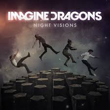 This album cover is different to the other two, there is no main focus on the star image and no close ups of the band members, instead the band has gone for a more abstract look and played on the title 'Night Visions' making the cover dark and like a star-y sky. The band's name is much more stylized in this cover and stands out the most out of all three, it has too as its what the fan buying it have to identify with, they don't have the initial recognition of band members.
I think for my digipak I'm going to combine the last too by having faces edited together in an abstract way with a stylized titile that stands out and demands attention. I think it's the best that fits our song and new artist entering the pop-rock genre.
Rihanna:
The Script:
Imagine Dragons:
I think for my digipak I'm going to combine the last too by having faces edited together in an abstract way with a stylized titile that stands out and demands attention. I think it's the best that fits our song and new artist entering the pop-rock genre.
Thursday, 5 March 2015
Magazine Ad Research - Beyonce

What I like about this album advert advert is that it features the close ups of the artist so she is easily recognizable to those who will see this ad campaign, It also has her name in big letters and the release date so people know whose album it is and when it's being released. I like the sepia tone effect and I think it would stand out in a media world that is full of bold colours, having something duller and sepia toned is interesting and different. However, I still think the main element of this ad is the star image for the initial recognition to make people stop and read further to see she has released an album.
Sunday, 1 March 2015
Feedback on Social Media
After completing our music video on Friday we decided to share the video on Facebook to get feedback from a wider audience. It was really nice to see the comments people left.


Friday, 27 February 2015
Band Name and Finishing Editing
We have officially finished editing, just in time for the deadline!! I am very happy with our final product and we have been getting good feedback.
Also, we finally came up with our band name. After mind mapping a few ideas we decided to settle for 'Depuis' which means 'since then' in french. I like the fact that the band name is french, and I think it sounds cool.
Also, we finally came up with our band name. After mind mapping a few ideas we decided to settle for 'Depuis' which means 'since then' in french. I like the fact that the band name is french, and I think it sounds cool.
Tuesday, 24 February 2015
Audience Feedback
After showing the class a first draft of our music video we were left with some feedback to think about, and some ideas to help improve our video before the final cut.

Some of the improvements included:
Some of the improvements included:
- Fixing some of the lip syncing which was out (which has been sorted)
- Breaking up some of the lip syncing (we used cut-aways and overlapping for this)
- More editing to the beat of the song (I adjusted some of the clips so they transitioned on the beat)
Wednesday, 11 February 2015
Clothing Ideas
For our video we have 4 fictional characters and our performer, and each of the 4 fictional characters have 2 separate 'personalities' and therefore slightly different outfits.
Poor/Accessories
This character doesn't really develop much so the two outfits are very much the same. (She cannot suddenly have lots of money for clothes) after looking at other media portrayals of poorer people on the streets we decided our character should be a tracksuit. To develop this for the character at the table we added a 'broken' necklace. This shows her development but also offers a link between the two scenes.


Lonely
For this character we took the stereotypical boring person not having friends/people making fun of her. However, at the table she doesn't change. She's still quiet and sits there, and at the end she's left alone but playing the game she comes across as more confident. This is why her outfit doesn't change.


Busy/Laid back
We wanted this character to go from well dressed at a well paid corporal job to laid back and more casual and child-like. This is why she goes from wearing smart clothes to a Mickey Mouse sweater.


Failing/Smart
In school this character is roughly dressed with her tie loosely done and she's failing. At the table she puts more effort into how she looks.


Poor/Accessories
This character doesn't really develop much so the two outfits are very much the same. (She cannot suddenly have lots of money for clothes) after looking at other media portrayals of poorer people on the streets we decided our character should be a tracksuit. To develop this for the character at the table we added a 'broken' necklace. This shows her development but also offers a link between the two scenes.
Lonely
For this character we took the stereotypical boring person not having friends/people making fun of her. However, at the table she doesn't change. She's still quiet and sits there, and at the end she's left alone but playing the game she comes across as more confident. This is why her outfit doesn't change.
We wanted this character to go from well dressed at a well paid corporal job to laid back and more casual and child-like. This is why she goes from wearing smart clothes to a Mickey Mouse sweater.
In school this character is roughly dressed with her tie loosely done and she's failing. At the table she puts more effort into how she looks.
For our singer we decided to dress her in normal clothes.
Thursday, 5 February 2015
Audience Feedback Video
We are half way through editing our video and decided to stop and ask some people for feedback on what we've done so far.
Sam Smith - Lay Me Down (music video)
I was scrolling through YouTube when I came across Sam Smith's new music video for his song 'Lay Me Down'. I knew he wanted to make a song/video celebrating being with the person you love regardless of who they are, and wondered how the director of the video would get Sam's message across within the length of a song.
The video is shot in one continuous take. The camera seems to be handheld but steadied to reduce shaking but allowing a lot of movement. The entire video is shot in the one location, the church, but after showing the original setup the camera tracks down the left side of the aisle, panning in on some of the people, showing their emotions. Whilst this is happening the right-hand side change clothes/positions, changing the church from a funeral setting to a wedding setting. As the camera pans onto some of the wedding guests Sam then re-positions himself for a third and final setup of him sitting alone in the church, as if gay-marriage acceptance is his prayer.
I like how you get full view of the emotions in all three settings, the sadness and heart-ache from the funeral. The happiness and acceptance at the wedding. The frustrations as people wait for LGBT marriage to accepted by everyone, regardless of faith or race. I think this is an important message to be putting our there and I'm glad that they're more videos highlighting the importance of LGBT acceptance, such as 'Hoizer -Take Me To Church' and 'Macklemore - Same Love'
Sunday, 1 February 2015
Editing Effects
For our music video we have had to edit effects onto some of our footage. All of our footage had to be muted as we didn't want any of the ambient sounds to interfere with the song.


We also de-saturated the lip syncing footage by the wall to break up the narrative. We thought this would add a good contrast which is common in performance-narrative mix videos, it is good to have a definitive split between the story and the performance.
Wednesday, 28 January 2015
Editing Progress
Ashleigh and I have been making very good progress with our editing, we've sharpened up some of the lip syncing but decided we need some more locations to keep it fresh and stop it being too repetitive. We decided that the lip syncing should be in black and white. This separates the singer from the 'characters' and helps break up the story a bit better.

Tuesday, 20 January 2015
Filming Final Scenes
After looking over our footage we decided to redo the lip-syncing (we didn't like the outfit) but we kept the location and shots. We also finally got round to filming the back-story for the last girl. Instead of the original idea of a 'rich girl' with a broken home we chose to use a powerful business woman who is plagued with stress from her high-demand shot. We also decided not to smash a mirror - there was no where that we could smash it. Instead we had the idea to throw her office supplies on the floor and to break down crying as this would be simpler to film.


Friday, 16 January 2015
Framing and Composition
The idea behind framing and composition is to make sure that the focal point is complimented. A change of composition and framing can not only change the focus of the shot but the feel of the shot too.
For example, centred portraits demand attention. However, this is over used and is losing impact. This contrasts with placing a portrait using the rule of thirds.
The rule of thirds is designed to place objects for the most impact. The frame is split into 9 squares and the lines cross at four points. Placing the focus of the frame onto any of these intersects ensures that it has the viewer's attention and makes the shot more interesting.


According to the rule of thirds, eyes in a portrait should be roughly 1/3 of the way down. Shots should also allow for headroom and a leading space to make the shot look more balanced.
Lines in a shot are important, experimenting with them can have artistic outcomes, sharp edges of building can be powerful and diagonal lines of bricks lead focus.

Other shots to consider are birds-eye view, high and low angles, canted angles and eye level shots, a mixture of these keeps the video interesting.
For example, centred portraits demand attention. However, this is over used and is losing impact. This contrasts with placing a portrait using the rule of thirds.
The rule of thirds is designed to place objects for the most impact. The frame is split into 9 squares and the lines cross at four points. Placing the focus of the frame onto any of these intersects ensures that it has the viewer's attention and makes the shot more interesting.
Lines in a shot are important, experimenting with them can have artistic outcomes, sharp edges of building can be powerful and diagonal lines of bricks lead focus.
Other shots to consider are birds-eye view, high and low angles, canted angles and eye level shots, a mixture of these keeps the video interesting.
Tuesday, 6 January 2015
Avicii - The Nights
This video by Avicii is so creative, I love the use of loads of different camera angles including underwater, aerial, point of view as well as a 'selfie' style. I also like the use of time-lapse and slow motion as little fillers to break up the action shots. I also love the settings used as they really bring out the summer-vacation vibe that the song has.
Friday, 2 January 2015
Imagine Dragons - I Bet My Life (music video)
Although Imagine Dragons are classed as Alt. rock/indie rock/indie pop I find that a lot of their songs could also cross into the pop rock genre boundary, like our artist Chloe Howl. What I love about Imagine Dragons' music videos are that they are massively narrative, and quite often don't entirely fit the lyrics. Their videos contain a lot of low key lighting and cold colour schemes. In this video I love the shots used to transition between the 'worlds' within the video, the one around 1:49 is similar to one we want to use in our video to transition from one of the backing stories.
Subscribe to:
Posts (Atom)