Whilst thinking of designs for my digipak I thought it would be best to look at three different arists who could be considered part of my chosen genre and look in depth at how they've constucted they're covers and digipaks. The artists I chose were Rihanna, The Script and Imagine Dragons.
Rihanna:
Rihanna's digipak is all about star image. There is a focus on her red hair which flows well with the red colour of the roses which leads onto the rose design of the disks. There is no link between the album title 'Loud' and the design of the digipak. However, it does get across Rihanna's personality and music style to to her target audience and a design like this allows them to instantly recognise that this is her album.However, I am not too fond of the writing in this album as it is very thin and faint making it hard to read.
The Script:
I like how this album cover is very simple and in black and white. The band's name is in a stylized font so it stands out and it is easily recognisable (like a logo, something to think about in my design), the title of the album is also bold and clear in the corner. Like Rihanna, there is still a star focal point in this cover as the center of the frame, and most of the composition is taken up by lead singer Danny's head, the hair of which is then filled in with the faces of his band members. This is a creative way to get across the star image of the entire band rather than standing in a line.
Imagine Dragons:
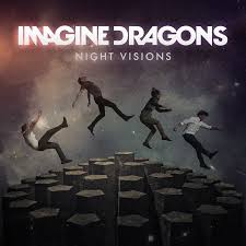
This album cover is different to the other two, there is no main focus on the star image and no close ups of the band members, instead the band has gone for a more abstract look and played on the title 'Night Visions' making the cover dark and like a star-y sky. The band's name is much more stylized in this cover and stands out the most out of all three, it has too as its what the fan buying it have to identify with, they don't have the initial recognition of band members.
I think for my digipak I'm going to combine the last too by having faces edited together in an abstract way with a stylized titile that stands out and demands attention. I think it's the best that fits our song and new artist entering the pop-rock genre.



No comments:
Post a Comment